The bar that started it all
The project didn’t start as a cabinetry project. I was on a personal mission to eradicate this coastal, beachy, blue-green color that had covered nearly every wall in my house from the palette of my home. I had painted the entire kitchen and living area already, but this mini bar by the eat in section of my kitchen had an upper cabinet with glass doors and that color on the backer board. It was a peel and stick wallpaper. My first thought was to remove the wallpaper and keep the cabinet, maybe add a backsplash.
Original eat-in kitchen and bar area
The minute I tried to pull the peel and stick paper off, it started to shred. As with many of my DIY projects, Plan A was quickly unraveling. I debated several options before pressing pause and really thinking about what I wanted this bar space to be. Sure, I wanted the color gone, but was that all?
Original peel and stick wall paper in the upper cabinet in the bar area
My background is in digital product innovation and development. I spend most of my day thinking about what problems I’m trying to solve for different users. It seemed to me that this problem in my eat-in kitchen was no different. I wanted the color gone, but removing that color only solved one aesthetic problem for me, and in fact, my first attempt at solving that problem created an even bigger aesthetic problem.
The key to user experience design is acknowledging that great designs solve meaningful, persistent problems, first. So I made a list of problems with that bar area:
I wanted to display and access our dinner dishes right next to our dining table. The dishes were being stored in an upper kitchen cabinet closer to the stove than to the table.
I wanted silverware to be nearby as well. The lower cabinet drawer was used as another junk drawer.
The area also needed to store liquor, wine, and other bar mixers. I didn’t want them out in the open, but I wanted them to be accessible.
Eating dinner as a family, at our table, with our good dishes and silverware is a tradition that is important to me. I want dinner to be an experience for our family, so creating that atmosphere and those routines were must-haves.
That space didn’t have any of it’s own lighting
Although the space is small, and tucked to the left of the pantry, it’s highly visible from our living room, when you walk out of our bedroom, and coming into kitchen area. The current design was disconnected from where I was taking the rest of the open kitchen/living/dining area
When I grouped these problems, I knew I needed the mini bar space to solve two problem areas:
Storage - both behind doors for things like liquor and visual, open storage for “dinner”
Continuity- visual and functional continuity were important. The space needed to feel like it fit and connected with there rest of the room, and it needed to facilitate the dinner ritual
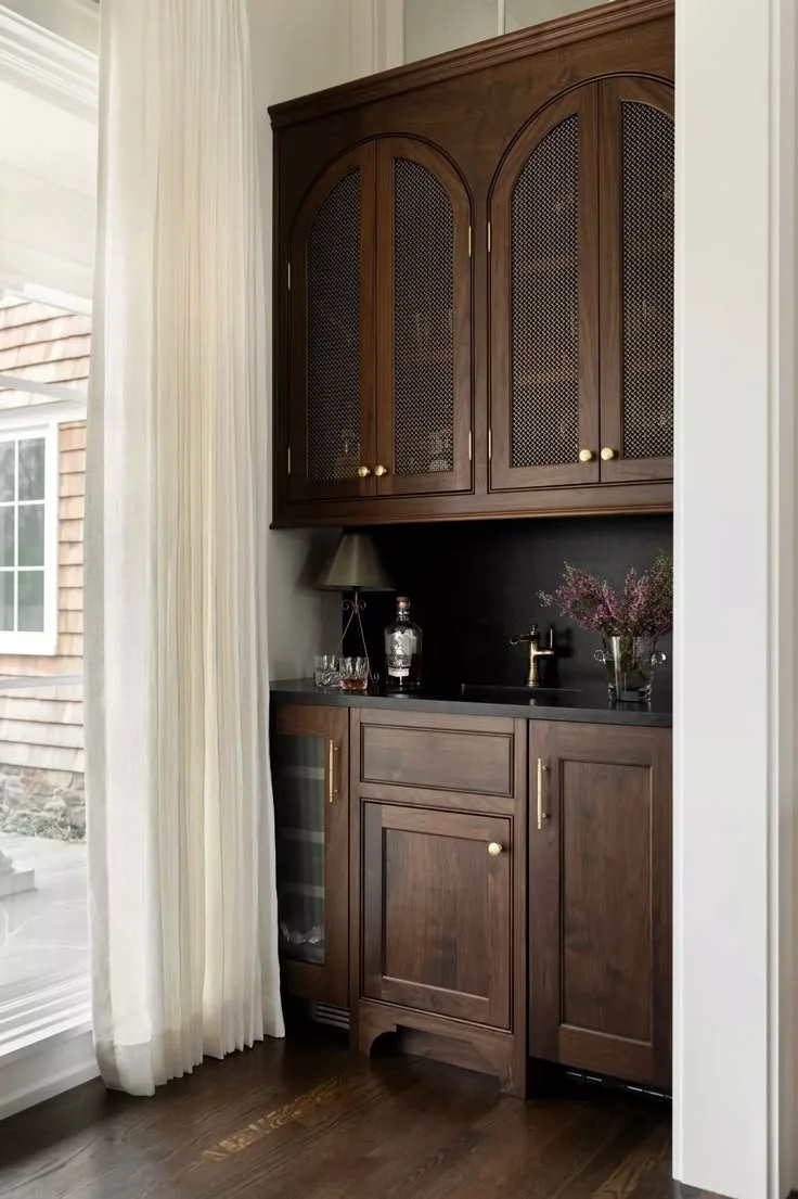
Once I knew what problems I needed to solve, the visual form could come to life. I started building out a Pinterest inspiration board.
Visit my Pinterest board for more inspo
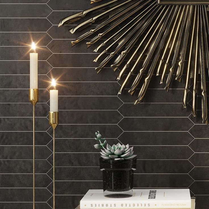
We were experimenting with soft, matte, blacks throughout the open living space. We had made the bold decision to paint our lower cabinets in the kitchen black, and leave our uppers white. The small space lent itself to invert the palette- leaving the lower cabinet white, and bringing the black to the upper section. Once I saw this Tile Club tile, the design came to life.
Picchetto Graphite Matte Ceramic Picket Tile
I knew I wanted to take the tile from counter to ceiling, and to solve my visual storage problem, I wanted open shelving. I played around with the idea of wood shelves, but my Dad is a welder by trade, and I thought he might be able to make me some stainless steel shelves instead, to add a hint of industrial flair to the space.
The last big decision I needed to make was about the countertop. I had been saving and planning to get new counters for the rest of the kitchen, but because this tiny space is separated from the rest of the counters, and I was still months away from getting those new counters, I thought maybe I could do something a little different in this section. Butcher block was an affordable and easy solution, plus it brought a much needed wood tone and texture to the design.
Unf. Signature American Walnut 12 ft. L x 25 in. W x 1-1/2 in. Thick Solid Butcher Block Countertop
We began the work of taking down the upper cabinet, removing the original tile backsplash and pulling out the granite counter top. I also needed to reorganize a few of my kitchen drawers and consider what I wanted on my open shelves. While I fretted over which new kitchen dishes and glassware, the work of installing the tile and countertops got underway. We took the steel shelves to be powder coated so they would remain scratch resistant.
And then just like that, the main install was done and I was ready to decorate. I set out my new Crate and Barrel china, paired with my elegant Pottery Barn glassware and balanced it with old trinkets and strategic greenery. Finally, to solve our lighting problem, we added a battery powered picture light. It can be recharged, and is remotely controlled.
I thought I was done, but all good design can and should evolve. We added two elements to our mini bar that I love and actually make the space so much more personal. First, the Breville Espresso maker. This was a Christmas gift to my husband and the minute we set it up, it was like a missing piece fell into place.
A few months later, my best friend gifted me a custom painted Veuve de Cliquot champagne bottle by Michelle Bell Art. The design of the bottle mimics wallpaper I had installed in two of the alcoves in my home and it made the design so much more personal.
This Elevate project was not about starting over, it was about upgrading what was already there to meet my families’ needs, and creating continuity throughout the space. And maybe the most important thing about design? It makes me smile every time I see it.


